Code
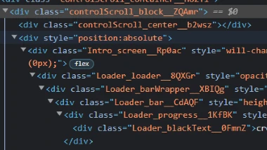
The code on the Singula website is very interesting. Much like the Envylabs website, Singula is using a bunch of divs to set up their site. What makes their code interesting is that they have divs nested in divs nested in divs, etc... The screen stays static while the user scrolls and this causes the different divs to become active. I find this layout interesting as I haven't seen anything like it yet.
User Interface - UI

The user interface is simplistic. The user simply scrolls and various information is presented to the user as they scroll. There is not really any navigation to deal with as the site is designed to be just a scrolling site. Kind of reminds me of a giant power point presentation.
User Experience - UX

The user experience for this site is both interesting and frustrating at the same time. There are little animation breaks in the page that allow the user to play with the animated balls that appear on the screen. This is the interesting bit. The frustrating part is that the site is designed as a scrolling information board with a sign up link at the bottom. This means the user is at the mercy of the site. Navigation is limited, and the information being presented is determineed by the site not the user. This is the frustrating part.
Summary
The Singula site is an intriguing site because the design is so different from the designs that I am used to. While I can see the advantages of having a scrolling site, reducing the user interaction to this alone is frustrating. It tends to feel as if you are being force fed information. It creates a feeling that the user has a lack of choice. The website also feels as if there is a complete absence of design. There are only three colors: black, white, and purple. The majority of the site is words, and floating balls. By being so simplistic and lacking any real visuals, it looses the message of what they are trying to present.